

Product Exercise Day 12 — Pablo by Buffer
How Buffer Uses Pablo and Separate Apps to Validate Future Functionality

This is day 12 in my 30 day challenge to product exercise
WHAT MAKES THEM SUCCESSFUL?
Social networks have been moving towards images for awhile. Facebook images are prioritized in Edgerank. Tweets with images get 150% more retweets. Instagram and Snapchat are very visual networks. Images can spice up anything that is shared.
This creates a problem for sharing text. How do you make text stand out versus all the photos and videos out there? You make text into an interesting image that adds context.
There have been two main approaches to this:
The TweetShot and apps like OneShot that take a snapshot of the page of text, complete with emphasis added via highlight. This creates a lot of context and can stretch beyond 140 characters, but it’s not the most visually interesting image.
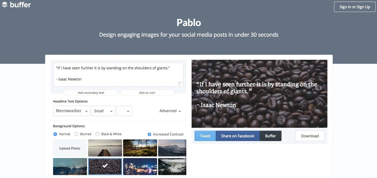
A short quote with a background image. The image can add context or just visual flair. This is great for adding emphasis to a point and making a post stand out. This is the approach Pablo takes.
Either approach involves multiple steps to complete. Pablo is successful because it takes steps out of this process and makes it easy to fire off a post in under a minute. Do we really want to be spending longer on our tweets?
WHAT DID THEY GET RIGHT?
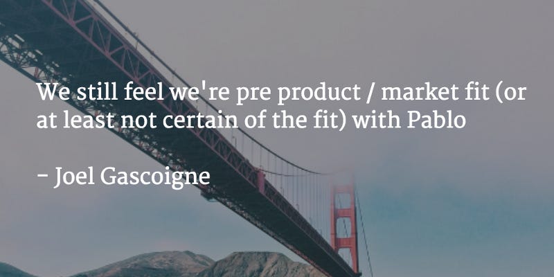
Pablo is an experiment. Joel Gascoigne, Buffer co-founder and CEO, says that this is an MVP that is pre-product/market fit. They believe the product has enough value to be launched, but needs to be optimized. Based on live user data, Buffer can tweak the experience to increase adoption.
The biggest thing Buffer is validating is the trade-off between simplicity and power.
Simplicity is informed by analytics. Are some features not being used often? How many people put in text and submit with all the default options? The UI and options offered need to be informed by this data.
Power is mainly informed by qualitative user feedback. Are there feature requests for missing functionality? If so, the product may not be powerful enough.
I think Buffer set themselves up for a successful test. Each component part of the process has a couple of options associated with it to validate. The text composer has secondary text and icon options. The headline has basic and advanced font options. The image includes a number of curated images, an image uploader, and simple ways to tweak the image. There are three ways to share the final post and a download option. This range of options for each component will allow them to validate their hypotheses quickly.
HOW DID THE PEOPLE BEHIND THIS PRODUCT THINK ABOUT THIS IDEA?
There are three main parts of sharing on social media: discovering content, posting the content, and measuring engagement. Buffer’s goal is to create more value within their ecosystem for all three parts of the process such that there is no need to go to the social networks themselves for posting. This in turn leads to paying customers.
Buffer has built Suggestions and Daily by Buffer to help with discovering content to post. All posts from Buffer have analytics that are tracked within the app. The key value for posting content has been the ability to schedule posts. While this does create value (it was the core value when the product launched), the Buffer post editor is largely the same as those found directly on the social networks themselves. Meanwhile, posting needs have evolved.
Pablo allows Buffer to truly offer an enhanced posting experience. Now users can create text posts, posts with pictures, and images of text easily. The latter is a big differentiator versus the native posting experiences.
Daily and Pablo have been created as separate apps outside of Buffer mainly as tests. Because the tests are in separate experiences, it reduces noise in the experiment. It also allows Buffer to avoid changing their main app before they have validated hypotheses.
The results of these tests will then integrated into the main Buffer experience. I don’t think it’ll be long until we see a Buffer posting experience in their browser extension, webapp, and mobile app that adds in the core of the Pablo functionality. A user would be able to create a new type of post along with regular text and image posts all in one editor. That’s a reason to pay.
Thanks for joining me for day 12 of Product Exercise. I changed up the headline today to see if people who be more attracted to. I may continue to do this.
I’ll be posting another Product Exercise tomorrow in this collection. If you found this post helpful, entertaining, or inspiring, I’d appreciate if you hit the recommend button below.